Project Summary | Branding, UI/UX & Responsive Web Design
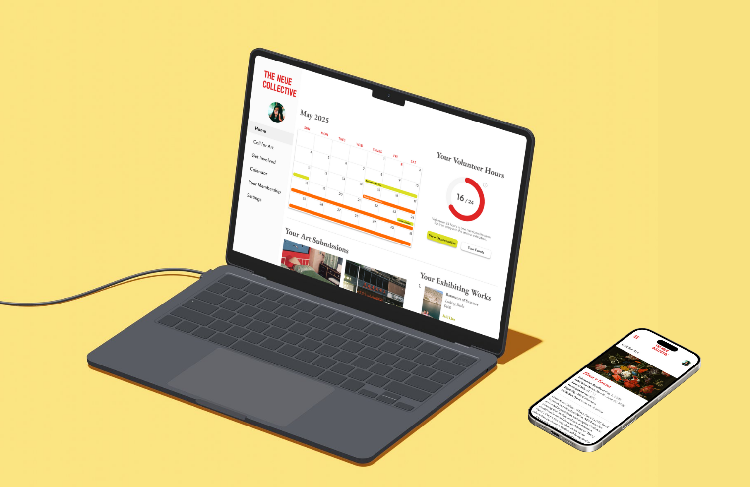
THE NEUE COLLECTIVE is a rework and rebranding of a website for the fine arts organization, The National Association of Women Artists, Inc., which offers exclusive exhibition and professional growth opportunities to its artists. The collective is volunteer run but the lack of a website dedicated to time sensitive information and ineffective email correspondence result in member unawareness of volunteer opportunities, upcoming art shows, and their membership benefits.
This responsive dashboard design consolidates resources and information for its artists to access. It streamlines exhibition and volunteer submission processes through straightforward UX and engages users with its thoughtful UI and integrated branding.
Background | NAWA
1889 - In an era when women artists were associated primarily with crafts and decorative arts, the founders of The National Association of Women Artists Inc. (NAWA) envisioned an organization which would promote higher standards for women artists and provide them with the opportunity to exhibit their work.
However, despite its legacy, NAWA experiences difficulty engaging its artists and retaining existing members.
Some key findings from a recent survey with its 800+ members:
1. The website & member portal is difficult to navigate so members cannot find important information on it.
2. There are not enough opportunities to network with members or other industry professionals.
3. Members feel that there are no benefits or incentives to continue their NAWA membership.
Research & Findings
Problem:
Members of remote, art organizations feel discouraged to volunteer or renew their memberships when they are constantly frustrated with the website and are unsure of what the organization offers.
Hypothesis:
The lack of a comprehensive website and the ineffective communication reinforces members' unawareness of professional or volunteer opportunities and their membership benefits.
Research Goal:
I want to identify what members would want to see in their dashboard and what they hope to gain so that they want to renew their memberships.
Participant Interviews
I conducted phone interviews with artists to gain knowledge of what kind of information/content is engaging and important to them.
Affinity Mapping
Research Findings
Participants were willing to volunteer & become involved in an art association if there are opportunities to meet other members and build community.
Most of the participants keep track of their commitments by setting up reminders for themselves and/or having the commitment in their line of vision to remember (post it notes, widgets, etc.).
Though participants are always looking to develop their artistic style, there was a greater want to grow professionally.
User Quotes
“If I like the people and the organization, I will volunteer”
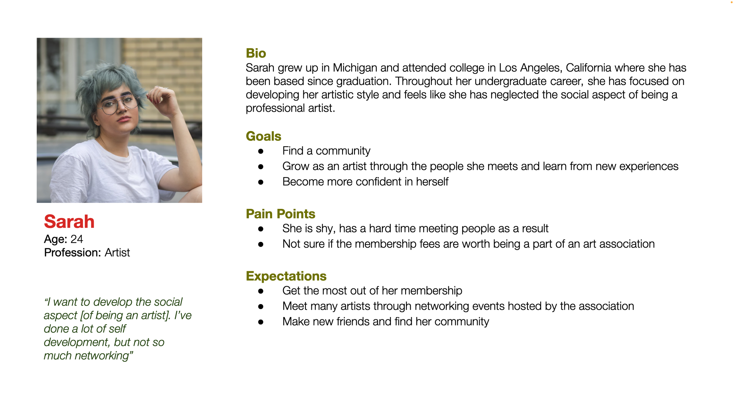
“I want to develop the social aspect [of being an artist]. I’ve done a lot of self development, but not so much networking”
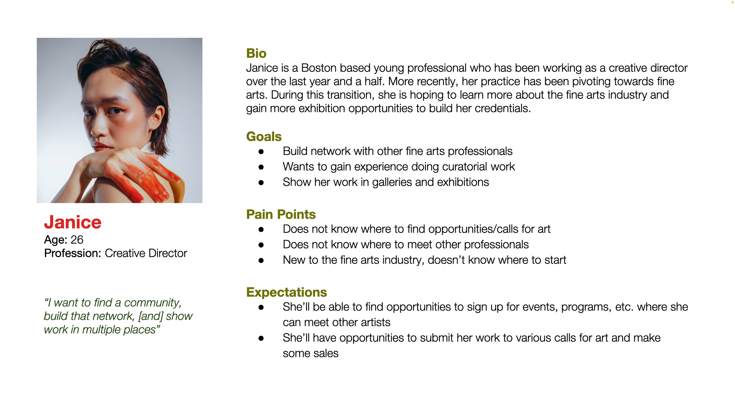
“I want to find a community, build that network, [and] show work in multiple places”
Project Goals
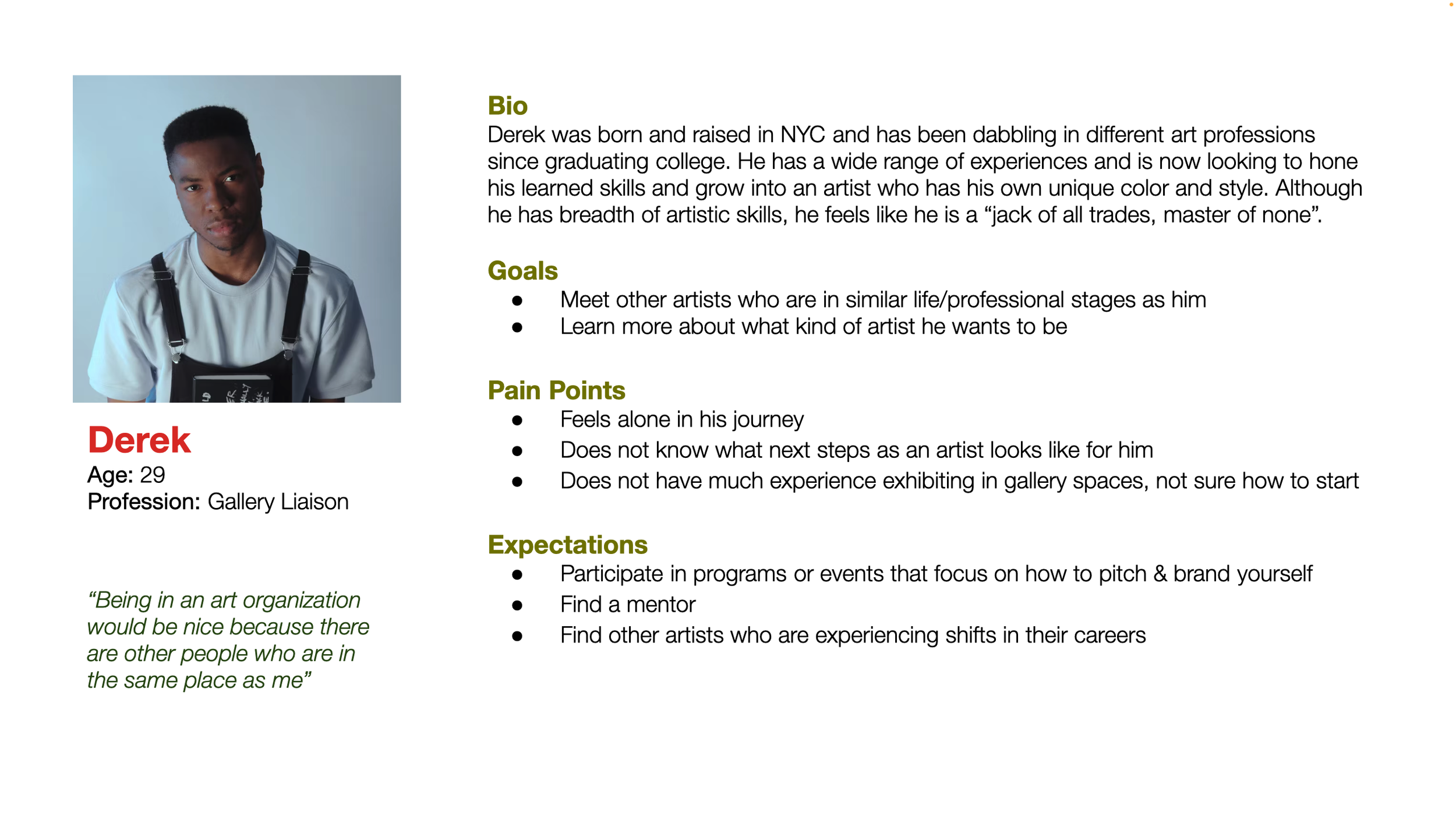
Personas
Information Architecture
Volunteer Sign Up Flow
Call for Art Flow
UX Design | Low Fidelity
With the research and findings in my back pocket, it’s time to start thinking about how to actualize the findings through the UX. I began this process with some quick sketches to play around with different ideas and then created wireframes on Figma to test the user’s experiences of these flows.
Sketches
Dashboard
Volunteer Sign Up screens
Call For Art Entry screens
User Testing | Mid Fidelity
The only way to know whether the flows are clear to artists is to test them out. I tested a mid-fidelity prototype of the Volunteer Sign up experience since it contains suggestions based off the initial research and is less standard than a Call for Art submission form.
Key Findings:
Language on some of the buttons is misleading and confuses the users.
Zig-zagging of event cards are distracting
The confirmation screen needs better phrasing and more next steps to inform the volunteer that they have successfully signed up.
Iterated Mid Fidelity Prototype
Overall, the users felt that the overall experience was clear and efficient. I implemented the participant feedback and made changes to the responsive dashboard to address the points of confusion.
UI Design | High Fidelity
In this reimagined rendition of NAWA, I created a new fine arts organization named THE NEUE COLLECTIVE. I wanted the branding and UI of this responsive dashboard to appear professional and reputable, cultivate community for its artist members, and be centered around an inclusive membership.
Moodboard & Branding
High Fidelity Screens
I created high fidelity screens for the Call for Art and the Volunteer Sign up features utilizing the participant feedback from the mid fidelity prototype tests. I applied the branding and style for a uniform and polished look to the hifi screens.
Applying to the Flora y Fauna exhibition.
Call for Art - Mobile View
Signing up for shifts to volunteer at the Greenpoint Art Fair.
Volunteer Sign Up - Desktop View
User Testing
To test whether the iterations from mid fidelity to high fidelity addressed the tension between the participant and dashboard comprehension, I conducted high fidelity tests for both the Call For Art and the Volunteer Sign Up features.
Measures of Success:
Ease of completion (less than 5 minutes to complete)
No confusion in the UI language
Clarity in the task that needs to be completed
Testing Goals:
Receive feedback on streamlining flows
Mitigate moments of confusion
Target areas of the UI that could be improved
Key Findings
60% of participants were confused by the language used in section headers.
80% of participants wanted to see more of the form on each screen so they can scroll less.
Feedback received was largely on rearranging the order of content - user’s opinions.
UI Iterations
Solutions
1. Clearer Header Language
Old UI
New UI
2. Height of headers on forms made shorter & color differentiation in form progress bar
Old UI
New UI
3. Less cards per section on the dashboard so that more content can be shown on the screen
Old UI
New UI
Final Prototypes
Signing up to volunteer for the Greenpoint Art Fair.
Volunteer Sign Up
Laptop Prototype
Tablet Prototype
Mobile Prototype
Call For Art
Submitting an application to the Flora y Fauna exhibition.
Laptop Prototype
Tablet Prototype
Mobile Prototype
Reflection
What were the main challenges you encountered during the process of creating this project?
Nuances in the choice of language (headers, call for action, etc.) and the impact it has on how the user navigates the dashboard.
Prioritization of content (some participants wanted to see certain things on the dashboard, whereas others found more importance in other content).
Sacrificing aesthetics for means of accessibility (certain font sizes may have been aesthetically nice, but to address legibility issues, adjustments were made).
How has this project contributed to your growth as a UX designer?
It was exciting to create a design solution for a problem that I encountered at my previous workplace but was unable to address due to lack of organizational bandwidth. I felt that my knowledge of the problem NAWA had helped me make informed decisions to design a responsive web design that met user’s needs while staying true to the organization’s goals. This project reinforced in me the notion that UX designers produce successful solutions best when they have adequate knowledge of what needs resolution.
What next steps would you take to improve the project further?
Develop the volunteer forums and how admin, leaders, and volunteers would interact with one another.
Set up the profile building flow for members to create an artist profile that the public and organization members can view.
Identify the membership or administrative levels and where their access to the dashboard differs.


