Project Summary | End to End Application
According to a 2022 survey by the Association for Pet Obesity Prevention (APOP), 59% of dogs and 61% of cats in the United States are overweight or obese. The pet industry is saturated with various foods that have different nutritional values, making it difficult for pet owners to give the appropriate meal portions.
Meowplan provides cat owners with tools to create balanced meal plans for their pets. The ultimate goal is to give them peace-of-mind that they are providing intentional attention and care for their cats.
Hypothesis
Contemporary owners struggle with portion control and nutrition since nutritional value across different food brands vary.
Research Methods
Comparative & competitive analysis to learn how competitors offer similar services and what they might be lacking.
Research Goal
Competitive Analysis
We want to learn more about pet owner goals, motivations, pain points, and other relevant insights on how they approach pet health.
Interviews
Conducted zoom interviews with pet owners on how they approach pet health, particularly feeding their companions balanced and nutritional meals. Emphasis on contextual-inquiry type questions.
Competitive Analysis
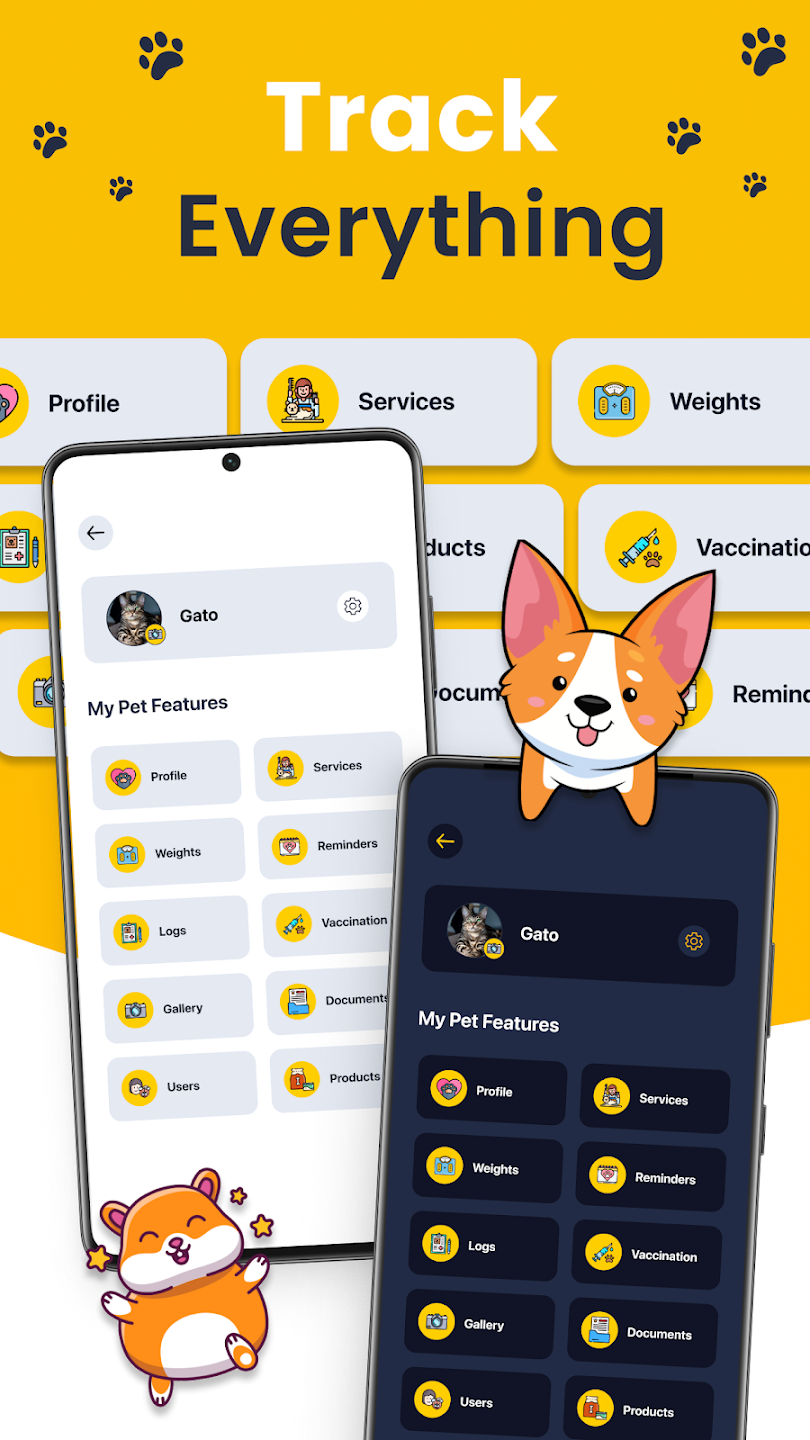
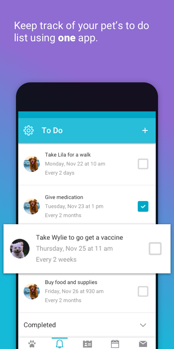
DogCat App
Features:
Alleviating owner's anxiety of losing track of pets’ health through helpful reminders.
Pros:
DogCat app was developed with ease of use in mind, so pet owners can enjoy their pets worry free.
Cons:
Heavily dependent on user input. Feels more like a reminder or notes app and less of a health app.
PetDesk
Pros:
Connects owners with pet care providers, request appointments, get reminders, and access everything you need to prioritize your pet’s health in just a few taps.
Features:
Organizes all levels of pet care in one comprehensive platform
Cons:
Covers a broad range of services, resources that are provided feel surface level as a result.
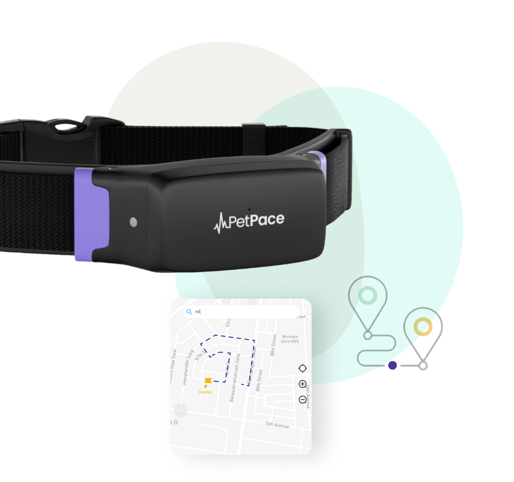
PetPace
Features:
Patented smart collar that monitors your pet’s health and well-being by wirelessly and non-invasively tracking its vital signs plus other physiological and behavioral parameters.
Pros:
Since pets can’t tell us how they feel PetPace does it for them.
Cons:
Owner needs to purchase a PetPace collar in order to take advantage of the services provided through the app.
User Interviews
Through interviews with five cat owners, I learned about their goals for their pet, motivations, pain points, and other important insights on how they approach pet health. By asking both pointed and open-ended questions, I gained a range of perspectives from each participant in order to narrow down a design solution that addresses their most pressing needs.
Research Findings
Uncertainty in Portion Size
Difficulty trusting online resources that share what and how much to feed their cats because each source states different things.
Deficit in Resources
Compared to other kinds of pets, like dogs, there are not as many resources for cats.
Overweight
All five participants had cats who fell in the “overweight” category.
User Quotes
“There is more care and training for dogs and less resources for cats”
“Cats are very secretive about hurting, I’m worried she is hurting and I don’t know about it.”
“I wish I could know if my cat food is actually good for my cat”
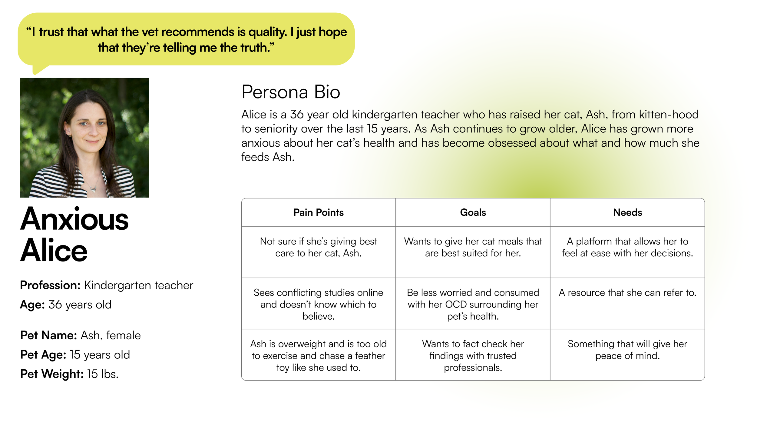
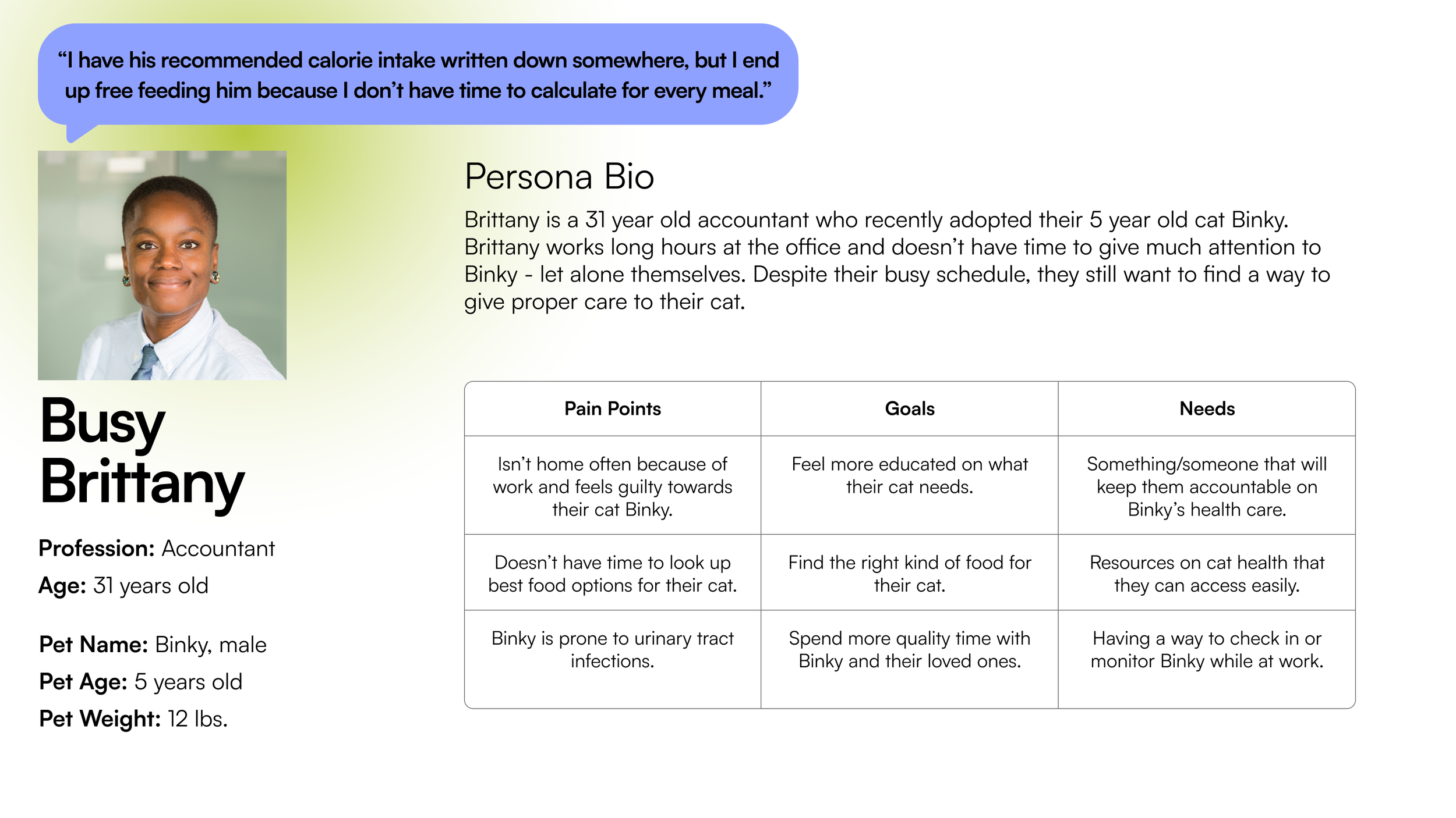
Personas
Problem Statement
POV Statement
Cat owners feel anxious about the food and the amount they feed their cats because there are not a lot of resources available regarding cat health.
HMW
How might we help cat owners feel less anxious about the meals they provide for their cats and fill the gap in the lack of cat resources?
How might we narrow down options for cat owners who feel overwhelmed by conflicting information and the sheer number of food options they find online?
How might we give cat owners an easy way to calculate or keep track of their cats caloric intake so that they do not become overweight?
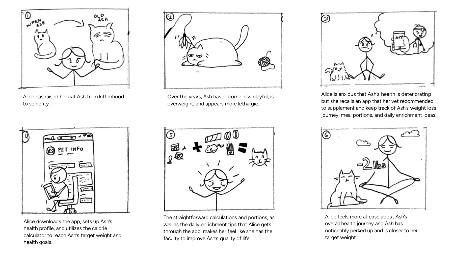
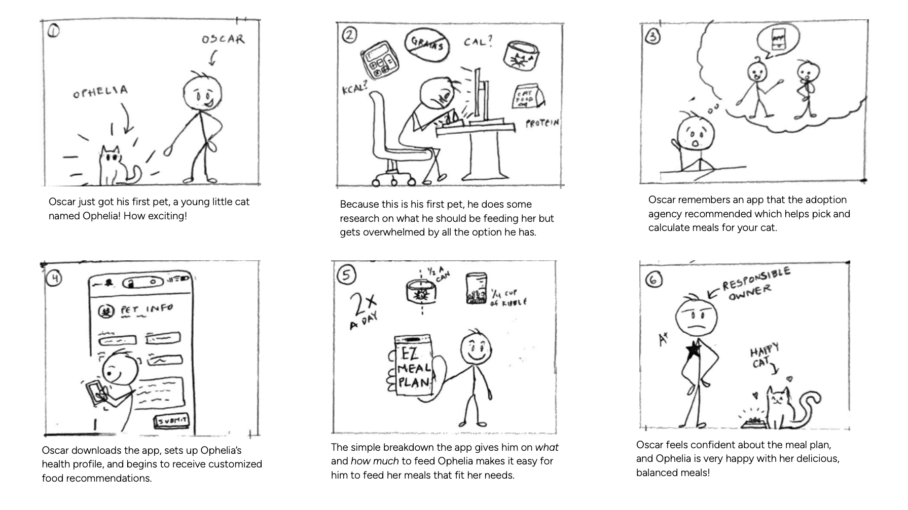
Solution Vision
Information Architecture
Sitemap
Add Cat User Flow
New Meal Plan User Flow
UX Design | Low Fidelity
Now that the information architecture has been thought out, I began the UX design process with some quick sketches to play around with different ideas. I then created wireframes on Figma to test the user experiences of these flows.
Initial Sketches
Home/Dashboard Screens
Meal Plan Screens
Wireframes
Add Cat Screens
New Meal Plan Screens
User Testing
I tested whether users can successfully add their cat and set up a new meal plan. Using the lo-fi Figma prototypes, I observed five users as they interacted with these experiences.
Definitions of Success
Ease of completion (less than 5 minutes to complete)
Ability to easily find the appropriate forms
Selecting the correct components/buttons to move through the screens
Finding the experience fun and engaging
Findings
Language could be clearer
One participant tried to add a cat through a section of the dashboard that I did not realize was misleading
Some icons or buttons were difficult to click (area too small)
Users could not tell that they can view individual meal breakdowns from the meal plan overview.
No menu bar made it complicated for users to navigate to specific screens.
I made these changes and then moved on to High Fidelity screens.
Branding
I wanted the branding for meowplan to embody the qualities of autonomy, confidence, devotion, and charming playfulness.
As for the logo, I incorporated a cheeky cat face into the “w” of meowplan. Meowplan can sound like “meal plan” when said out loud, which felt appropriate for an application that is focused on providing cat owners tools to create balanced meal plans for their pets.
Moodboard & Logo
Assets

UI Design | High Fidelity
I created high fidelity screens for the Add Cat and the New Meal Plan features, incorporating the participant feedback from the low fidelity prototype tests. I applied the branding and style to these iterations.
Add Cat Screens
New Meal Plan Screens
Final Prototypes
Creating a profile for the addition of a new cat, Oreo.
Add Cat
New Meal Plan
Setting up a meal plan for Oreo.
Conclusion
Learning Moments
How can it inform the work you do in the future?
In the future, I will inevitably work on a project where I feel like I’ve hit a wall. I’ve learned from this process that it is ok to step away from the computer for a while to let my ideas marinate and develop. Ideas and creativity aren’t produced in a vacuum, and I should give myself grace and allow solutions to slowly reveal itself while not rushing the process.
What could you have done differently?
I could have done more exploration with sketches and wireframes in the beginning of the project to get my creative juices flowing before designing the detailed UI. I focused early on the task flows and had each key step identified, but I ended up doing more brainstorming in the middle of the high fidelity screens because I hadn’t fully thought out the interactive elements of the screens.
Future Applications
What challenges did you face?
I am more familiar with website interfaces and UI over mobile-based app interfaces. Because of this, there were moments where I felt certain components or UI elements were not working.
What did you learn from the process?
I learned that sometimes taking a step back and coming back to iterate can lend a lot of insight to what the solution might be. It is sometimes more productive to sit on the problem, ruminate on participant feedback, and then return to the problem with a new perspective that can only be generated with time.
Next Steps
What next steps would you take to improve the project further?
I would want to actualize the quick scan tool in meowplan and create the rating and compatibility screens.
I would like to map out how the user selects which cat they want to see the scanned food’s rating for. Maybe the user can select more than one cat at a time and see the different ratings of the food for each of them.
Cat parents LOVE to post their babies, so I want to design the community board and see what kind of content would be found there. Maybe it could serve as a subreddit or forum for cat owners to voice all their questions or concerns that might be more common than they think.


